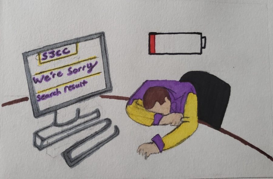
Students and teachers both share their inconveniences with Canvas and the San Jose City College website.
The main issues from the school website is how cluttered the home page is as well as it being difficult to find what you are looking for at times.
The area in which Canvas lacks is accessing the website at a reliable time. There have
been instances where the site has crashed due to the amount of students using it during a given time.
This is an important issue to address since there is plenty of valuable information that has the potential to be used, but if the systems in place are not adequate, then it will not be useful.
Over the years, San Jose City College has had positive changes as well as negative, in this
case outdated infrastrures like the school website are a representation of a bad thing.
It is crucial to understand that Canvas has been a great help especially during the pandemic with it being easy for students to submit homework and for teachers to assign homework without needing to hand out actual papers.
This does not mean that the school as a whole is bad in any way but it would not hurt to
rejuvenate certain aspects of the school website.
Not only would this be a positive, but it would create a pleasant experience for most
students. Whether you are a new student who is trying to find information about your schedule, or a returning student who knows how the system works, the last thing you want is to be confused when accessing and utilizing these tools.
During the initial weeks of this 2022 fall semester, I have been hearing other people’s
stories and experiences with these resources.
Jea Hernadez, 18, undecided major has some recurring issues regarding the school website such as difficulty trying to find the login of the website and things like self service.
Some ways this can be adjusted is by having clear concise steps detailing how to get to
the self service portal so students do not have to deal with complicated interfaces.
Apart from students, I wanted to hear the perspective from a teacher’s point of view.
When referring to the interface on the San Jose City College website Sanhita Datta, Biology teacher, said there was too much movement and too much dancing around.
Furthermore reinforcing the idea that there are too many options that clutter the
homepage of the school’s website.
There needs to be more that is done to help find a creative but simple way to highlight the
most important information on the website, without having to add too many complicated
dropdown menus.
With that being said it is imperative that the school website and Canvas should be improved. Not only would it bring positive experiences for current students including myself, but also new students, and faculty who are excited to come to this school. Having the ability to use the school website and Canvas should not be a daunting task to interact with, but something that is there whenever you need it. Applying to the school should be simple and not complicated.


